Milky Way

How I Got the Shot: Milky Way and White Dome Geyser, Yellowstone

Milky Way and White Dome Geyser, Yellowstone. Nikon D5 with an Irix 15mm f/2.4 lens, light painted with a Luxli Viola. 25 seconds, f/2.8, ISO 6400.

The Location

I love Yellowstone National Park’s White Dome Geyser. I’ve been photographing it since 2010.

I first targeted it as the solution to a self-challenge. While preparing for a 10-day shoot in Yellowstone, I’d had a sudden inspiration that I wanted to silhouette a geyser eruption in front of a sunrise or sunset. I started researching which of the park’s 500 geysers would give me good chances for a good photo. In my mind, three criteria were important:

  1. The geyser had to erupt frequently. I didn’t want an hours-long window between eruptions, because I needed to be able to time it with a sunrise or sunset.

  2. The geyser had to erupt predictably. That solves the same problem as above—if the estimated time of the predicted eruption was wrong by two hours, I wouldn’t be able to time the eruption with a sunrise or sunset.

  3. The geyser had to have an aesthetic quality that could be silhouetted. A hole in the ground wouldn’t work—physical structure was important.

After a fair amount of pre-trip research, I settled on White Dome Geyser. Its eruption times can vary, but not nearly as widely as most other geysers (the average interval is about half an hour for White Dome, as opposed to hours, days, weeks, months or years for others); it’s relatively predictable, rarely varying by more than 30 minutes or so; its presence is visually notable, as it features a sinter cone that rises 12 feet from the ground.

The geyser didn’t disappoint. Once I arrived on location, it took me three tries (because of weather), but eventually I got my shot (Figure 1). Then over the years I fondly visited and photographed White Dome a few more times, during daylight and moonlight. I’ve come to know the spot well.

Figure 1. White Dome Geyser erupting at sunset in 2010. Nikon D3 with a Nikon 80-200mm f/2.8 lens. 1/800, f/5.6, ISO 200.

So this past September, when Tim Cooper and I were leading a night photography workshop in Yellowstone and we had the idea of light painting an eruption with the Milky Way in the background, I had an inkling for a geyser that might work. White Dome would be a good target once again, for all the reasons mentioned above. We did a daytime scout with PhotoPills (Figure 2), which showed that the galactic core would be behind the geyser by about 10 p.m. Perfect!

Figure 2. PhotoPills proved our hunch that we could photograph the Milky Way behind White Dome geyser that week, and told us what time we could expect that to happen.

The Shoot

We never have just one idea for a location—we come loaded with a few (including, in this case, star circles over a nearby hot spring), and of course we let workshop participants run with their own ideas as well. On the night we visited that location, most of the group shot by the hot spring, because that photo opportunity was immediate, while the White Dome idea wouldn’t work until a few hours into the evening, after the moon set.

With that being the case, the idea for the Milky Way behind the geyser was nearly forgotten. Folks did some twilight light painting, followed by Tim and I running a long demo to help participants set up for shooting star circles under moonlight, followed by an hour-plus of everyone chatting under the night sky while their cameras ripped a series of 2-minute exposures.

Except for James and me.

Earlier in the evening I’d set up a series of star-circle exposures over White Dome Geyser. I wanted to go back to stop the camera, and James, one of the workshop participants, decided he’d join me.

After breaking down that north-facing setup, I remembered the Milky Way idea and we circled the geyser to see how things were lining up. The answer? Perfectly! We decided we’d do a quick setup—not to wait for the geyser to erupt, but to just light paint the steam with the Milky Way in the background.

We set up our tripods, and worked out our compositions, focus and exposure. Then we added some light with a Luxli Viola. The approach was straight-forward. We didn’t have much choice for an angle to light from, because we could walk on only one side of the geyser (the side with the paved road)—so we just walked far enough to get a 90-degree angle at the steam. The only real question was how much light to add, and we figured that out with just three test shots (Figure 3).

Figure 3. Testing the light painting. From left: a little too much, a little too little, almost perfect.

We were very happy with that third shot, enough to pack up and move back to the rest of the group. We came within seconds of breaking down our setups, when—swoosh! Water started gushing skyward!

We couldn’t have timed it better if we’d tried. We were already set up, composed, focused and dialed in with our exposure, and we knew exactly how much light to add and from where to add it. All we needed to do was execute everything again. So we did. And we got the two shots in Figure 4.

Figure 4. The two photos that include the eruption.

The Reshoot

James and I were ecstatic about our … well, let’s not say at “luck,” but rather at the meeting of luck and preparation. On the way back to the group, we were pretty charged about the image we’d just made. We showed the rest of the participants, and they were excited too, enough so that four of them wanted to stay late to shoot a similar photo.

By the time we made it back to White Dome, an hour had passed. It was almost midnight, and the Milky Way had moved. Seven of us set up along the side of the road, and Tim and I set two Violas on the ground, pointed toward the geyser. We tested our exposures, and waited.

But this time, we weren’t as fortunate. We encountered a few problems.

First Reshoot

We didn’t have to wait terribly long for the next eruption. White Dome blew again at about 12:30. We were all excited and started shooting. But …

Unfortunately, someone had the Luxli Composer app open on their phone and accidentally touched a control. Instantly the light color changed from the nice warm temperature of 3200 K to bright blue (Figure 5). White Dome’s eruptions last about two minutes, but the maximum flow occurs for less than half of that. When you’re dealing with a 15- to 25-second exposure, that means you usually get one good shot—maybe two—per eruption. The color change happened during that narrow window, so … well, we missed the shot.

Figure 5. First reshoot. Oops.

Still, we were enjoying the now-dark sky (the moon had set two hours earlier by that point) and the quiet surrounds of a beautiful national park—not to mention each other’s company. So we got over our disappointment and settled in for another try.

Second Reshoot

That opportunity came 50 minutes later—at 1:23 a.m. But …

At exactly 1:20 a.m—just three minutes before the next eruption, for the first time all night, the breeze shifted. All of us had set up compositions with the galactic core to the left of the geyser, and now the steam was blowing across—and obscuring—the Milky Way. Then, swoosh!, White Dome blew. Once again, we didn’t get the shot.

Figure 6. Second reshoot. Dang wind!

We were deflated. We were disappointed. And we were exhausted. We were done. We decided we couldn’t and wouldn’t wait for another eruption.

Then a funny thing happened: We waited anyway. We didn’t break down. We didn’t pack up our gear. We didn’t leave. Instead, we stood there talking and laughing and, for some reason, not getting any more tired. I can attribute that only to something about the magic of nature at night.

Third Reshoot

Thus, when the geyser blew again at 2 a.m., we were ready. The Milky Way was tilting perfectly. The light was right. The breeze was blowing gently to the right. Everything was perfectly in place, and we all got the shot (Figure 7).

We felt good. In fact, we felt great! We hooted, we hollered, we high-fived. Then we packed the cars to head back to the hotel, hitting the road about 2:30 a.m. and the beds well after 3:00.

Figure 7. Third reshoot. Yay!

Wrapping Up

All the takes on that night’s scene were straight-forward: just the right exposure with the right amount of added light. As such, the post-production didn’t require anything fancy or complex—just basic adjustments to tune the white balance and exposure, then to boost local contrast with Dehaze and Texture.

The biggest matter in post was choosing which frame I like the most. By the end of the night I’d had two cameras running—one vertical and one horizontal—and thus I had about 20 exposures with the geyser actually erupting (plus about 120 with just steam). Many of the images had merits, but I decided that my first take with James was my favorite. I just liked the way the water and steam were moving in the composition, mimicking the shape of the galactic core.

Milky Way and White Dome Geyser, Yellowstone. Nikon D5 with an Irix 15mm f/2.4 lens, light painted with a Luxli Viola. 25 seconds, f/2.8, ISO 6400.
Chris Nicholson is a partner and workshop leader with National Parks at Night, and author of Photographing National Parks (Sidelight Books, 2015). Learn more about national parks as photography destinations, subscribe to Chris' free e-newsletter, and more at www.PhotographingNationalParks.com.

UPCOMING WORKSHOPS FROM NATIONAL PARKS AT NIGHT

Keeping Our Galaxy Real: How Not To Overprocess the Milky Way

Note: This post concludes with a video of Gabe walking through how to process a realistic-looking Milky Way. Want to jump straight to that? Click here.


Do you remember the first time you saw the Milky Way?

So few of us have access to starry skies that the wow factor was undoubtedly very high. What you saw on the back of your camera and then on your monitor was even more exciting, and in this excitement you probably pushed your post-processing to bring out the stars just a bit more … and just a bit more … and just a bit more … and. …

This is a very normal and common experience. However, taken too far, it also detracts from reality—many of the night images we see online simply do not reflect what the Milky Way actually looks like.

In this post, I aim to help you process your Milky Way shots in a more natural and realistic way.

Milky Way panorama. Nikon D750 with a Nikon 14-24mm f/2.8 lens at 14mm. Seven stitched frames shot at 30 seconds, f/4, ISO 6400.

Star Witnesses

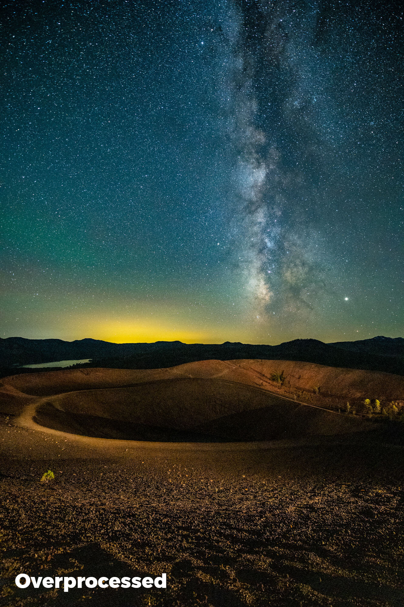
If you search the 3 million images tagged #milkyway on Instagram, you’ll notice that over 80 percent of them are overprocessed.

What do I mean by that? In those images, the Milky Way looks very unrealistic—too contrasty, over-sharpened and full of colors that jump out at you. In short, it looks like no Milky Way we have ever seen in the actual sky.

Yet the likes and positive comments pile on! Why is this?

The general public is still unfamiliar with what the Milky Way really looks like. Their only experience with it is what they see online. The Milky Way still has a high wow factor, and as technology and post-processing techniques become more powerful, photographers can eke out all sorts of additional detail. The problem is that so many eke out every detail.

We want to bring a realistic vision back to the Milky Way. The Milky Way should be the chorus to your song, but all good songs have a gradual build: highs and lows that build to that chorus. A good photograph should guide us throughout the whole image with a similar tempo.

Below is an example of a Milky Way image that is processed naturally versus one overprocessed in a way that’s commonly seen on the web. Note that in the overprocessed version the tonal range is not as smooth, the colors are too punchy, and there is very little separation between the Milky Way and the stars that surround it.

The left version might look "wow," but the right is closer to what the Milky Way actually looks like. Nikon Z 6 with a Nikon 14-24mm f/2.8 lens at 14mm. 15 seconds, f/2.8, ISO 12,800.

Avoiding Overprocessing

Most overprocessing pitfalls can be rectified by fewer global adjustments and more local adjustments. I know the global tools in Lightroom’s Basic module are right there and ready to use. But the astro-landscape photo is made of two different elements of exposure: the sky and the landscape. They often require different considerations on how to process them.

Globally applying Dehaze because it will successfully enhance your sky could very well have an adverse effect on the colors and shadows of your foreground. Unless your foreground is a silhouette, it’s best to think of your Milky Way image as two images and process them accordingly with local brushes and gradients.

If you are working under dark skies with little to no moonlight, you might even consider shooting two images: one correctly exposed for the stars and another longer exposure that reveals detail in the foreground. (I covered this type of blending of two images in my previous blog and video about Starry Landscape Stacker.)

An example of a blended image. First I shot a lower-ISO long exposure during civil twilight for the foreground, then a higher-ISO sharp-star exposure for the background, and layered the two in post-production. Being able to process the foreground and background separately allowed me to maintain a more realistic Milky Way. Hasselblad X1D with a Hasselblad 30mm f/3.5 lens. Foreground: 6 minutes, f/4, ISO 800; background: 23 seconds, f/4, ISO 6400.

Presence Sliders in Lightroom

Texture, Clarity and Dehaze are very attractive tools, as they can increase local contrast in a scene and really make an image pop. However, overusing them can lead to crushed shadows and unwanted shifts in color (as seen in the blog post linked above).

Think of these three adjustments as coming with great responsibility. To understand what they do, crank them to 100 percent, then slowly bring them back, and toggle between your full view and 100 percent to see how they fundamentally affect your image. Then when processing, use them judiciously.

presence.jpg
  • Texture

The newest filter in Lightroom (and the one I am most enamored by) increases sharpness without amplified grain or saturation. However, when overused, every star is sharpened and jumps out in the sky. This can compete too much with the Milky Way as well as falsely make every star look as bright as the next.

Depending on the scene, I like to add 3 to 8 points of Texture to my Milky Way by using a brush to add the effect locally. If I go above 10 on Texture, I really need to examine the effect at 100 percent zoom to make sure I’m not overdoing it. (However, that threshold applies only to the sky. If I have a well-lit rocky landscape, Texture is just what the doctor ordered to enhance the granularity of those rocks—for that I might use anywhere between 20 and 60 points.)

  • Clarity

I often use Clarity in lieu of the Contrast slider. I’ll adjust my white and black points first. Then, if the Milky Way needs more punch, I’ll slide Clarity to anywhere from 5 to 25. However, I always keep an eye on the top corners of my image, as Clarity quickly heightens any vignetting and can make smooth graduations in the sky seem choppy.

  • Dehaze

Brings contrast and saturation to an image. The former is great for boosting the low contrast that is often found in night skies. But keep an eye on that saturation—that’s where blues get wonky real quick. I never apply Dehaze globally; I typically apply it only via the Graduated Filter tool. My Dehaze adjustments can vary depending on the scene, but they usually range between 10 and 30.

It is also very important when you are combining global and local adjustments to remember that they build on top of each other. If you’re not precise in your workflow, you might get stuck fighting back and forth between how your global and local adjustments overlap and affect each other, sending you down the road of overprocessing. To avoid this, hone your global adjustments first, and only then start with the local changes to your Milky Way.

Another important thing to keep in mind is that our editing tools grow and change over time. I love Texture, but just a few years ago that tool wasn’t even in my imagination. It didn’t exist until about this time last year! Be sure to always keep a lookout for innovations in Lightroom that you can use to make your images better and better.

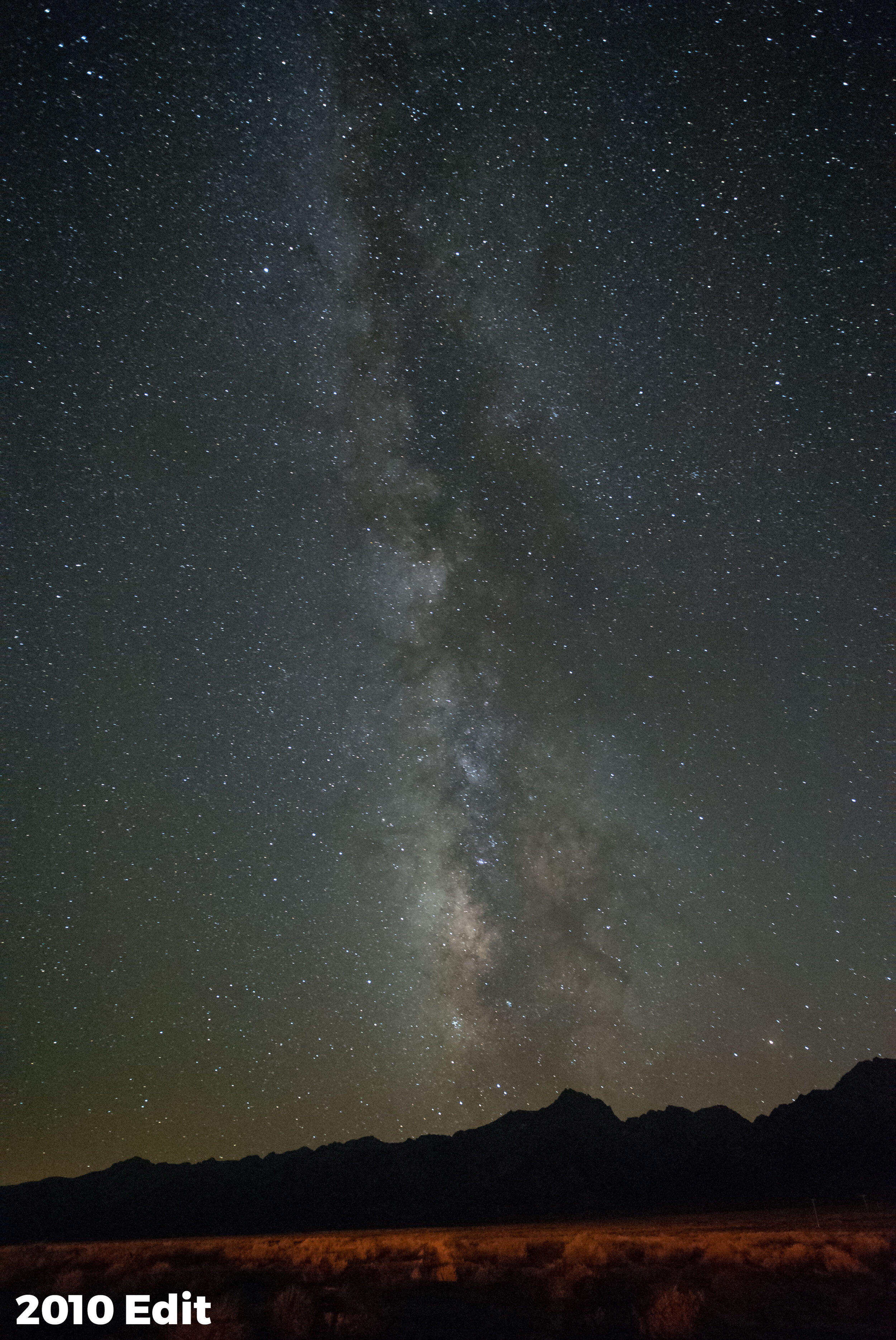
For example, I recently revisited the very first successful Milky Way image I’d ever shot. I hadn’t overprocessed then, but I had processed it with Lightroom 3 (below, left). That was a great program for its time, but it had some limitations compared to what’s on my computer today. Now, using Lightroom Classic 2020 (below, right), I get some finer detail out of the file.

Shot in 2010 with a Nikon D700 with a Zeiss 21mm f/2.8 lens at 30 seconds, f/4, ISO 6400. Left: Processed in Lightroom 3 with +12 Clarity, +11 Vibrance and +20 Luminance Noise Reduction. Right: Processed in Lightroom Classic 2020 with more subtle local adjustments, less noise reduction and more magenta.

Putting it All Together

I made this video that walks through my considerations for processing the Milky Way in a more natural way. I point out the sliders that we might slip too far on, and I share my Milky Way brush technique for subtly bringing out the finer details.

Now, if you’re one of the overprocessing culprits … First, know that you have a lot of company. But second, know there’s a better way, and we’re happy to help.

Stop processing the Milky Way with a hammer and a bucket of paint, and then share your images with us below in the comments. Or, better yet, share them online on Facebook or Instagram! Tag @nationalparksatnight and let’s educate the world on what the natural Milky Way really looks like!

Gabriel Biderman is a partner and workshop leader with National Parks at Night. He is a Brooklyn-based fine art and travel photographer, and author of Night Photography: From Snapshots to Great Shots (Peachpit, 2014). During the daytime hours you'll often find Gabe at one of many photo events around the world working for B&H Photo’s road marketing team. See his portfolio and workshop lineup at www.ruinism.com.

UPCOMING WORKSHOPS FROM NATIONAL PARKS AT NIGHT

Processing Star Point Images with the Help of Starry Landscape Stacker

We all love shooting under the stars, but oftentimes we are pushing our cameras and lenses to the extreme. In last month’s article we talked about “Shooting for the Sharpest Stars” and how that forces us into even higher ISOs and shorter exposures. Most cameras have difficulty at 6400-plus ISOs, and the shorter exposures make it tricky to get any detail in the foreground.

Enter the Mac-only software Starry Landscape Stacker (SLS), which blends multiple high ISO star point shots to reduce noise while keeping your stars sharp! (For PC users, your solution is Sequator, which operates and yields similar results to SLS. We will take a closer look at Sequator on our blog a little later this year.)

What is Starry Landscape Stacker?

SLS is a very intuitive piece of software that gives you smoother final images by recognizing and aligning the “tracked stars,” and then stacking the files while applying noise reduction to the other areas of the sky. This is probably the best piece of software to squeeze the most image quality out of multiple files instead of just working with one.

In this post, we’re going to look at the basics of how to use SLS. At the end, you can watch a video of me working through the details of processing an image this way.

Shooting Considerations for SLS

The key for both SLS and Sequator is that we shoot multiple images in the field—at least 10, but 20 is even better. The more information the program has, the better it will work.

So, once you settle on your star point composition, check focus and attain a good exposure, don’t just take one or two shots and move on. Instead, set your intervalometer to take 20 shots with a 1-second interval between. And you can certainly take more than 20 shots. If I have settled on a really nice composition, I might shoot it for an hour or so to get different alignments of the Milky Way as it moves across the sky.

We also have to consider the foreground. In the Figure 1 below, the exposure is good for the sky, but there’s hardly any information in the foreground.

Figure 1. Nikon D5 with an Irix 15mm f/2.4 lens. 25 seconds, f/2.5, ISO 6400.

How can we fix it? Three solutions:

1. Take a twilight shot.

If you arrive to your location prior to nightfall, take a few shots as the light varies throughout the twilights. You can use those later to blend into your star shot. Of course this approach works for only one setup per night (unless you have two or more cameras), but it can create a unique look. (In previous blog posts you can see examples of when Matt and Tim have done this.)

2. Light paint your foreground.

This works really well if we have something dominant in the foreground that is easily reachable with our light painting tools. However, if we have a big swathe of landscape, that will be difficult to paint.

3. Take a longer foreground-only exposure.

Lower your ISO, turn on your long-exposure noise reduction, and take a shot that is three to six stops higher than your sky shot. By using the a lower ISO we can get a cleaner foreground. But don’t expose so that it looks like a daytime foreground—my rule of thumb is to shoot a foreground exposure that gets the histogram off the left side and more in the middle (Figure 2).

Figure 2. Nikon D5 with an Irix 15mm f/2.4 lens. 13 minutes, f/2.5, ISO 1600.

My thought process on for this image: It was very dark, with no moon in the sky in Capitol Reef National Park, which is a Gold Tier Dark Sky Park. I figured an exposure of 4 minutes at ISO 6400 (three stops brighter than the sky shot) would start to reveal foreground. However, I also didn’t want the 6400 noise in the darker foreground, so I lowered my ISO two stops to 1600, which is incredibly clean on the Nikon D5. Adding five stops to my original image gave me an exposure of 13 minutes (should have been 16 minutes, but oh well), f/2.5, ISO 1600.

Don’t look at how bright the sky and the trailing stars are—the piece we want from this image is the foreground detail of the road cutting through the landscape.

Preparing Your Files for SLS

There are a few key things to do to your sky files in either Lightroom or Camera Raw to best prepare them for SLS. The idea here is to remove any chromatic aberrations and have a nice flat file that will help SLS align and combine the dimmer stars.

1. Lower the contrast of the image. I generally set my contrast to -100 and increase the exposure to +.30 (Figure 3). It won’t look good on the screen but that’s OK—just be careful you are not blowing out any stars.

Figure 3.

2. Turn off any sharpening and noise reduction. Bring the sliders all the way to zero (Figure 4). SLS will handle the noise reduction for now and we will do the sharpening after SLS stacks the image.

Figure 4.

3. Correct for lens aberrations. Under the Lens Correction section of Lightroom, check Remove Chromatic Aberration (Figure 5) and manually adjust any vignetting to even out the exposure of the image (Figure 6). I choose to manually adjust the vignetting instead of turning on “Enable Profile Correction” (EPC) because I’ve noticed weird artifacts/moire patterns in the stacked images when doing so early in this process. EPC adjusts for distortion and vignetting, so it’s best practice to apply the Lightroom adjustment (if you want) to the finished image after stacking in SLS. Again, our goal here is only to prepare a nice flat file that SLS can use to easily recognize the stars, sky and landscape for blending. Minimum pre-processing equals maximum results.

Figure 5.

Figure 6.

That’s it! You don’t have to remove airplane trails or satellites. SLS will help you remove them from or add them into the final image.

Once you have worked on the first image of your “batch” you can then quickly sync the adjustments to other files. Choose your best 10 to 20 consecutive images that have the best positioning of the Milky Way or stars, and export them as full-resolution 16-bit TIFF files that include all metadata (because SLS uses your exposure information when stacking). (Figure 7.)

Figure 7.

Processing in SLS

I’ll go into more in depth in the video below, but here are some overall processing tips:

1. Open the files in SLS. It will stack them together and there will be a bunch of red dots that identify the stars.

Figure 8.

2. Follow the “Workflow” instructions at the top left.

3. Adjust Dots in the Sky. Remove any red dots on the ground, along the horizon, in cloudy areas, or in any spots where there weren’t actually stars. You can even add dots into the sky if there are major areas in the sky that don’t have them.

4. Click Find Sky. That will create the blue mask of the sky; it doesn’t need to be perfect but should include all the areas where there are stars. If you have a horizon that has lots of trees cutting into the sky, choose “Mask with Islands of Sky” and that will let SLS know to create masks for the stars between the branches. You might need to clean this up, but SLS does an excellent job to get you started.

5. Align With. This will remove the blue mask. At the bottom of the workflow section it says Current Image. Click on Next and Previous to choose which Milky Way/star-point alignment you’d like SLS align to.

6. Align and Composite. This stacks all the images. You have to select a composition algorithm to choose:

  • Min Horizon Noise is the default and works in most cases. It brightens the Milky Way stars a bit more than the surrounding stars and minimizes the noise along the horizon.

  • If you do notice any star trailing or duplication along the edge of the mask, use the Min Horizon Star Dupe. There is also a “mean” version of the Horizon Noise and Star Dupe—this uses the older “median” algorithm that was seen in previous versions of SLS.

7. Click Save. SLS saves the stacked file to your folder of TIFFs. SLS gives you the option to save a copy of the mask; I generally don’t need it as the masked file works fine. You’ll need to import this new file into LR and then do any image massaging there.

Tip: You can save multiple algorithms of the stack. The Max algorithm reveals any airplanes, satellites or meteors. Save a clean Min Horizon Noise for minimal noise, but then save any meteors that came through and you can blend them together in Photoshop!

Walking Through an SSL Edit

That’s it! You now have the cleanest night skies out there! Check out the video below, where I go into detail and walk through the whole process. I also take the SLS night sky image and blend it with the foreground from the longer exposure in Photoshop.

Milky Way season is here and the temperatures are rising, bringing more noise into our shots. Use Starry Landscape Stacker to create even cleaner jaw dropping night images!

Gabriel Biderman is a partner and workshop leader with National Parks at Night. He is a Brooklyn-based fine art and travel photographer, and author of Night Photography: From Snapshots to Great Shots (Peachpit, 2014). During the daytime hours you'll often find Gabe at one of many photo events around the world working for B&H Photo’s road marketing team. See his portfolio and workshop lineup at www.ruinism.com.

How I Got the Shot: Stars and a Rock in Lassen Volcanic

Lassen Volcanic National Park. © 2018 Chris Nicholson. Nikon D5 with a Nikon 14-24mm f/2.8 lens, light painted with a Coast HP7R flashlight. 25 seconds, f/2.8, ISO 6400.
The Location

Last summer, Lance and I visited Lassen Volcanic National Park to shoot for a few days (er, nights). For both of us, it was our first time there, and we quickly discovered that this Northern California wilderness is one of the best kept secrets of the national park system. The scenery is beautiful, bewildering and varied: volcanoes of different types and shapes, snowcapped peaks, reflecting lakes, babbling brooks, lush meadows, multicolor pumice fields, steaming geothermals and more await photographers and their cameras. Not to mention … deliciously dark skies.

On our second day in the park, we stopped at a visitor center to talk to a ranger about possible places to photograph in the dark. She gave us a lot of great information, including an auto-tour map with suggested sites to see, and she marked the areas that she thought would be of interest to us. We ventured out for our daytime scouting, driving the main road (the aptly named Lassen National Park Highway), hiking short trails, making daytime photos (gasp!) and all-in-all enjoying the experience of being in the outdoors in such a captivating space.

Along the way we stopped at a trailhead parking lot that afforded a 360-degree view of mountain peaks and valleys, all with great visual lines to the sky above them—i.e., no trees, cliffs and so on that would block our sky views in any direction. In other words, it was a perfect place to set up for a night shoot. And then we spotted what turned out to be the star of the scene: a massive boulder perched at the edge of a cliff.

A scouting photo of the boulder.

A scouting photo of the boulder.

We were both pretty excited about the rock as a subject, as it has an interesting shape, is in an interesting place visually, is in front of an interesting background from all available angles, and we could safely set up and shoot from about 180 degrees around it. In other words, this was going to be a lot of fun.

Moreover, because the cliff faces south, we knew we could get the Milky Way galactic core in the composition. So we pulled out PhotoPills to see exactly when and where the Milky Way would appear, planned our shots, and then continued exploring the park with the knowledge that we would definitely return to this spot after sundown.

The Shoot

We arrived back at our shoot location early in twilight—so early that we couldn’t see the Milky Way yet, but that was fine because we were surrounded by many other creative opportunities. Lance ventured a little east on the cliff edge to work on a separate idea with a twisted tree, and I stationed a camera at the far end of the parking lot to rip some longish exposures over the mountain ridge to the west (Figure 1).

Figure 1. Star trails over a Lassen ridge. Nikon D850 with a Nikon 80-200mm f/2.8 lens. 6 minutes, f/6.3, ISO 64.

As the sky grew darker, I started working with the boulder. The Milky Way was not yet apparent in the sky, so I worked on some alternative compositions with the mountains in the background, using the silhouette of the distant ridge as a leading line into the rock (Figure 2).

Figure 2. Nikon D5 with a Nikon 14-24mm f/2.8 lens. 15 seconds, f/8, ISO 4000.

Once I was done with that, I looked south, and there it was: the galactic core rising over the valley. So I repositioned my camera and tripod to start working on the photo I was there to create.

The valley below the cliff is a scenic wonder in daylight (in moonlight too), but in pitch-dark it was just vast blackness—so I lowered my tripod to get it out of the frame (Figure 3). The real stars of the composition were the Milky Way and the boulder.

Figure 3. Working on the composition, but with a poor-choice white balance of Daylight.

Figure 3. Working on the composition, but with a poor-choice white balance of Daylight.

I worked the composition a little more, and then changed my white balance. I’d been using Daylight during the blue hour portion of the shoot, but once the sky darkened, I wanted a white balance that would help the sky look more like “night” and that would also help draw out the delicate colors of the Milky Way. So I switched the white balance of my D5 to manual and dialed it in to 3800 K (Figure 4). (For more on this, see Matt’s blog post “How to Choose the Right White Balance for Night Skies.”)

Figure 4. White balance at 3800 K.

Figure 4. White balance at 3800 K.

At this point you can see that Lance was in the background doing his light painting on a different subject. This didn’t bother me. First, I was only making test shots. I didn’t care about someone else’s light; I cared only about the specific elements that I was testing for, i.e. composition, focus, exposure, white balance, etc. Second, once I was ready to start executing my “real” image, I knew Lance and I could communicate and take turns light painting our different setups, and that when his flashlight was off, he and his camera would disappear into the shadows.

For focus, a quick check of a hyperfocal distance chart confirmed that I could lock in on the boulder and still have the stars sharp. So I shined my Coast on the rock and auto-focused. Easy peasy.

The exposure was pretty simple too. I knew I wanted sharp stars for a sharp Milky Way. Using the 400 Rule with a 14mm focal length, that gave me a top shutter speed of 25 seconds (400 / 14 = 28.57, rounded down to 25 for safety), which I shot at f/2.8 and ISO 6400.

Then I started working on the light painting. Using a Coast HP7R flashlight with a homemade color-warming filter, I worked from the left of the frame. I chose this angle for three reasons:

  1. Working from the right was nearly impossible because of the cliff drop. I could have done it if I learned how to fly, but I didn’t have time for that in the middle of the shoot.

  2. When light painting, I usually want the direction of the added light to “make sense” visually, to almost look like the illumination could be coming from something else in the scene—in this case, the galactic core. Of course no one will think that the Milky Way was actually bright enough to illuminate the boulder, but I find that the visual suggestion of it works better.

  3. When light-painting a subject on the right side of the composition, I usually like to have the light coming from the left, across the majority of the frame. (And vice-versa for a subject on the left.) If I’d painted from the other side (Figure 5), then the brightest, highest-contrast parts of the boulder would have been way over on the right edge of the frame, separated from the secondary subject of the image (the Milky Way) by a large shadow. That would have been far less compositionally effective. (This is a personal guideline, and an effective one. But it’s not a rule. In fact, you can see that I went against this guideline in the image above of the boulder without the Milky Way.)

Figure 5. I moved as close to the edge of the cliff as I could to light paint from camera-right, and the result proved the efficacy having the light come across the majority of frame. Also, it was nearly impossible to paint from that angle without h…

Figure 5. I moved as close to the edge of the cliff as I could to light paint from camera-right, and the result proved the efficacy having the light come across the majority of frame. Also, it was nearly impossible to paint from that angle without having the light hit the sapling too.

The final step was just a matter of playing around with the light painting, trialing-and-erroring, repeatedly coming back to the LCD to review my results. I was evaluating factors such as:

  • how out far out of the frame I needed to stand so the camera couldn’t see the flashlight

  • whether to use direct light (harder, more contrast) or reflected (softer, less contrast)

  • which angle to paint from to create the most texture

  • which angle would illuminate enough of the boulder to be interesting but not so much that I was light painting everything (which is boring)

  • which angle accomplished all that without lighting the sapling to the right of the rock, which I deemed a compositional distraction

  • how long to keep the light on so the boulder would be bright enough to draw interest yet subtle enough to not be garish or overwhelming

Failed iterations of my light painting approach. Or, rather, honing by trial and error.

Once I’d made all of my decisions, I was ready to make the final photograph. By that point Lance had joined me at the boulder, and we took turns light painting our individual setups. Again, the key was communication, so that we didn’t inadvertently ruin each other’s images—each of us asking if the other was in the middle of an exposure before turning our flashlights on.

I loved how everything came together. One of my field rules is that when I finish executing my idea, before changing the setup I always try something I wasn’t planning, just to push myself out of the immediate box and see if I stumble across a great idea. In this case, I tried backlighting the rock (Figure 6). I hated it—so I moved on. …

Figure 6. The failed backlighting idea.

Figure 6. The failed backlighting idea.

Incidentally, while I was doing all of this, I still had my second camera, a D850, capturing star trails from the top of the hill, creating the image in Figure 7. That’s a great use for having two cameras in the field—one for long exposures and one for doing other work during the wait.

Figure 7. Star trails over Lassen Peak. Nikon D850 with a Nikon 80-200mm f/2.8 lens. 13 minutes, f/2.8, ISO 160.

The Post-Production

This particular photography didn’t need a lot of work in post.

I cropped out the bright star that was sitting immediately on the right edge of the frame, where it served as only a visual distraction, pulling attention far away from both the primary and secondary subjects.

Using the Spot Removal tool, I cloned out a patch of snow that was picking up just enough light to be seen in the background, as well as one bright and three faint plane trails (Figure 8).

Figure 8.

I boosted Exposure (+20) and Whites (+34) to increase overall brightness, then Clarity (+19), Dehaze (+24) and Vibrance (+8) to add some punch to the sky (Figure 9).

Figure 9.

Usually I’ll go over the galactic core with a custom Milky Way brush, but I didn’t think this image needed it. Sometimes not doing something is the best decision.

Figure 10.

Figure 10.

The Final Adjustment

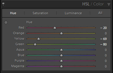
The last correction was one I couldn’t make by myself. The combination of using a CTO filter and shooting with a white balance of 3800 K made the light kind of green. I’m red-green color blind, so I asked Tim if he’d be a second (better) set of eyes while I tried to get the color of the rock accurate. Using the targeted adjustment tool in the Hue section of the HSL panel, we clicked a green sample in the rock and dragged down, which brought the Yellow slider to -69 and the Green to -80. The rock was then a little too warm, so we manually pulled Red down to -20. (Figure 10.)

There are two lessons here:

  1. Knowing how to work around your limitations can be critical. Much thanks to Tim, my sister Ann and several past girlfriends for helping me color-correct through the years.

  2. In the field, knowing my limitations and when shooting at a non-Daylight white balance, I should have used a Luxli Viola LED panel for the painting. Why? Because that would have allowed me to dial in the color temperature of the light to 3800 K or slightly warmer—then I would have known the color was accurate even if I can’t see it. (Another way to do this is to use a combination of color-correcting gels to alter the Coast’s output accordingly. Check out Tim’s post “Level Up With Light Painting: Correcting the Color of Your Flashlight (Part II).”)

Figure 11. The final image.

Wrapping Up

I finished my photo before Lance finished his. I tooled around with a few other image ideas in the same area (Figures 12 and 13), but soon settled on light painting Lance while he worked, creating a portrait of one night photography’s true masters in his element (Figure 14). By this time the moon had risen, which illuminated the valley in the background, adding more of a sense of place to the scene.

Figure 12. Tail end of the Milky Way over Lassen Peak. Nikon D5 with a Nikon 14-24mm f/2.8 lens. 20 seconds, f/2.8, ISO 8000.

Figure 13. Milky Way disappearing in the moonrise. Nikon D5 with a Nikon 14-24mm f/2.8 lens. 25 seconds, f/2.8, ISO 6400.

Figure 14. Lance at work. Nikon D5 with a Nikon 14-24mm f/2.8 lens, light painted with a Coast HP7R flashlight and a Luxli Viola LED panel. 25 seconds, f/2.8, ISO 6400.

Afterward we moved on to our second shoot location of the night, a placid alpine lake just up the road, where we ripped some long exposures of star-circle reflections above Lassen Peak.

Lassen Volcanic is truly an extraordinary national park. I have no idea when I’ll be back, but the day I am can’t come soon enough.

Want to explore Lassen Volcanic with Lance and Gabe on an epic night photography adventure workshop this August? Sign up here!

Chris Nicholson is a partner and workshop leader with National Parks at Night, and author of Photographing National Parks (Sidelight Books, 2015). Learn more about national parks as photography destinations, subscribe to Chris' free e-newsletter, and more at www.PhotographingNationalParks.com.

UPCOMING WORKSHOPS FROM NATIONAL PARKS AT NIGHT

The First Steps to Processing Milky Way Images in Lightroom

Capturing the Milky Way is one of the great joys of night photography. But why do some photos of this celestial phenomenon look better than others?

Post-processing your photos can really make the difference between a grab shot and a masterpiece. The good news is that you don’t need a doctorate in Photoshop to bring out the brilliance. A few simple tricks in Lightroom can go a long way in making your stars and Milky Way stand out.

In This Video

In the video below, I illustrate several tips, including:

  • adjusting white balance to make skies look more like “night”

  • using Dehaze to boost the look of the Milky Way

  • applying local adjustments to target effects

  • HSLing the image to nail the color

  • brushing some punch into the galaxy

So open up an image and follow along with the video to learn how to process your Milky Way images in Lightroom!

Note: Did you like that video, and think you’ll like more? Please consider subscribing to the National Parks at Night YouTube channel to get notified about all our new videos when they come out.

Tim Cooper is a partner and workshop leader with National Parks at Night. Learn more techniques from his book The Magic of Light Painting, available from Peachpit.

UPCOMING WORKSHOPS FROM NATIONAL PARKS AT NIGHT